Energetic, with purpose.
Sunlight yellow, living green and turquoise preserve the character of the original mark.

The energy of our original identity.
The clarity of a modern classic.
A shared language for everything we make.
 Modern Classic / Sunland America
Selected direction: Modern Classic. This guide refines the selected concept into reusable artwork and rules for review. The centered Modern Classic logo is used throughout the website.
Sunlight yellow, living green and turquoise preserve the character of the original mark.
Open space, confident type and direct language make complex development work easier to understand.
A parent-company identity for conversations with landowners, communities and development partners.
Sculpted currents form an open circular symbol. The Sunland name leads; the spaced AMERICA line is centered directly beneath it.




Keep at least one quarter of the symbol’s width clear on every side. In partner layouts, keep both marks optically balanced and separate them by at least twice this space.
Keep proportions. Never stretch, condense or rearrange the supplied artwork.
Keep orientation. The warm arc stays uppermost. Do not rotate or spin the symbol.
Keep it clean. No drop shadows, bevels, outlines or arbitrary recoloring.

Use the full-color symbol with white lettering on dark backgrounds. On photography, place the logo on a solid quiet panel; keep image details away from the lettering.
The original spectrum stays at the heart of the identity. Neutral surfaces give those colors room to work. Select a swatch to copy its HEX value.
Starting balance: 60% light surfaces · 25% charcoal · 15% color. Let imagery provide additional blue and green.
Use the supplied shared gradient in the logo. For supporting fields, use a 115° gradient: Sunlight → Golden hour (18%) → New growth (40%) → Emerald (60%) → Turquoise (80%) → Deep turquoise. Keep long text off gradients.
| Text / background | Contrast | Normal text |
|---|---|---|
| Ink / Paper | 13.99:1 | Pass |
| Muted / Paper | 6.25:1 | Pass |
| Paper / Ink | 13.99:1 | Pass |
| Ink / Sun | 10.19:1 | Pass |
| Ink / Aqua | 6.86:1 | Pass |
| Paper / Aqua | 2.04:1 | Do not use |
Ratios calculated from sRGB values. Normal text requires 4.5:1; large text requires 3:1. Bright logo colors are accents, not body-text colors. Status colors have separate semantic tokens; never use the brand gradient to indicate a form error. Print: convert with the printer’s ICC profile and approve a physical proof. No unverified CMYK or Pantone equivalents are specified.
Manrope is the core typeface for headings, paragraphs and interfaces. Its open forms echo Modern Classic without competing with the symbol.
ABCDEFGHIJKLMNOPQRSTUVWXYZ
abcdefghijklmnopqrstuvwxyz
0123456789 & % + /
Sunland uses Manrope at weight 650. AMERICA uses weight 500 with generous tracking, centered beneath the visible Sunland lettering. The provided vector files contain outlined letters: use them instead of recreating the logo in a text box.
Manrope is included under the SIL Open Font License. The kit contains the variable TTF for design tools and WOFF2 for websites. Use Arial, then sans-serif, as fallbacks; load with font-display: swap.
Download Manrope| Role | Size | Weight | Leading / tracking |
|---|---|---|---|
| Display | clamp(3rem, 6vw, 6.5rem) | 500 | 1.02 / -0.055em |
| Heading | clamp(2.25rem, 4vw, 4rem) | 500 | 1.08 / -0.045em |
| Title | 1.5rem | 600 | 1.25 / -0.025em |
| Body | 1rem | 400 | 1.7 / 0 |
| Label | 0.875rem | 600 | 1.4 / 0.05em |
Display: 48–104 px. Section headings: 36–64 px. Keep body copy at 16 px minimum and roughly 45–65 characters per line. Labels use 14 px; tiny captions are secondary only. Use tabular numerals for comparative data.
Applied type / illustrative copy
Good groundwork.
Clear possibilities.
Every site starts with a closer look at the land, its context and the path ahead. Explain the opportunity in plain language, then make the next step clear.
Explore the applicationsSample units: 24 acres · 18 months · 100 MW — formatting examples only.
Write like a knowledgeable development partner: direct, considered and approachable. Make the next step useful rather than making the claim bigger.
Use: We assess land, grid access and the approvals a project may need.
Avoid: We leverage a synergistic end-to-end ecosystem.
Use: Describe the current milestone, the evidence and what remains to be resolved.
Avoid: Our projects deliver guaranteed returns.
Use: A site may offer potential. Suitability depends on further assessment.
Avoid: Every acre is an energy opportunity.
Use: Share the location and a few details about your property.
Avoid: Unlock the limitless future today.
Company descriptor: Utility-scale energy storage developer.
Proposed brand line: Good groundwork. Clear possibilities.
Service explanation: Describe land evaluation, approvals and development in that order.
Next step: Invite a specific conversation or piece of information.
The descriptor and development sequence follow existing company website copy. The brand line and samples above are proposed language, not new business claims. Any capacity, schedule, project status, ownership or investment outcome needs current supporting evidence.
Explain the process and information needed. Use ordinary words and answer the practical questions first.
Be concise about scope, responsibilities, milestones and unresolved dependencies.
Listen, acknowledge questions and explain the project context without promising an outcome.
Use the established Verdant model world: sculpted green terrain, open blue skies, precise white structures and soft natural light. Vary the story and camera angle, not the visual language.
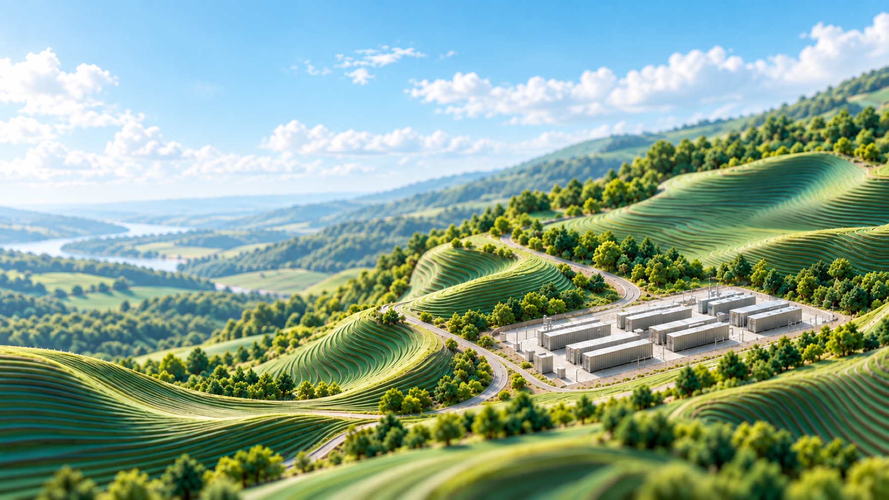
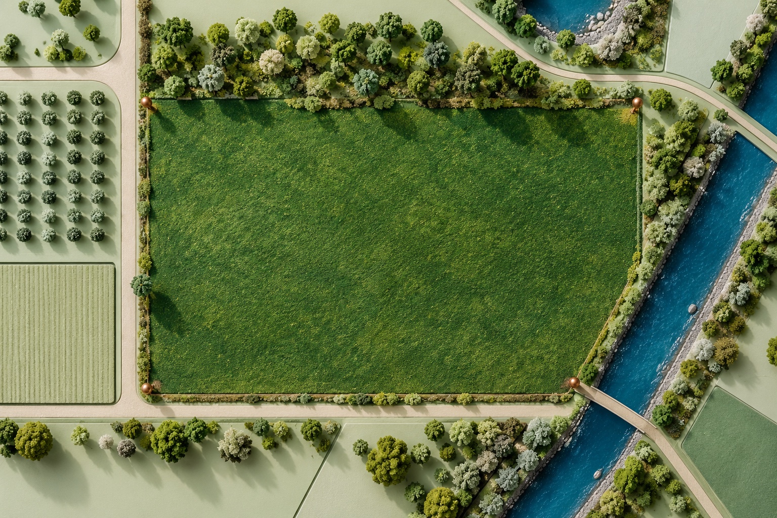
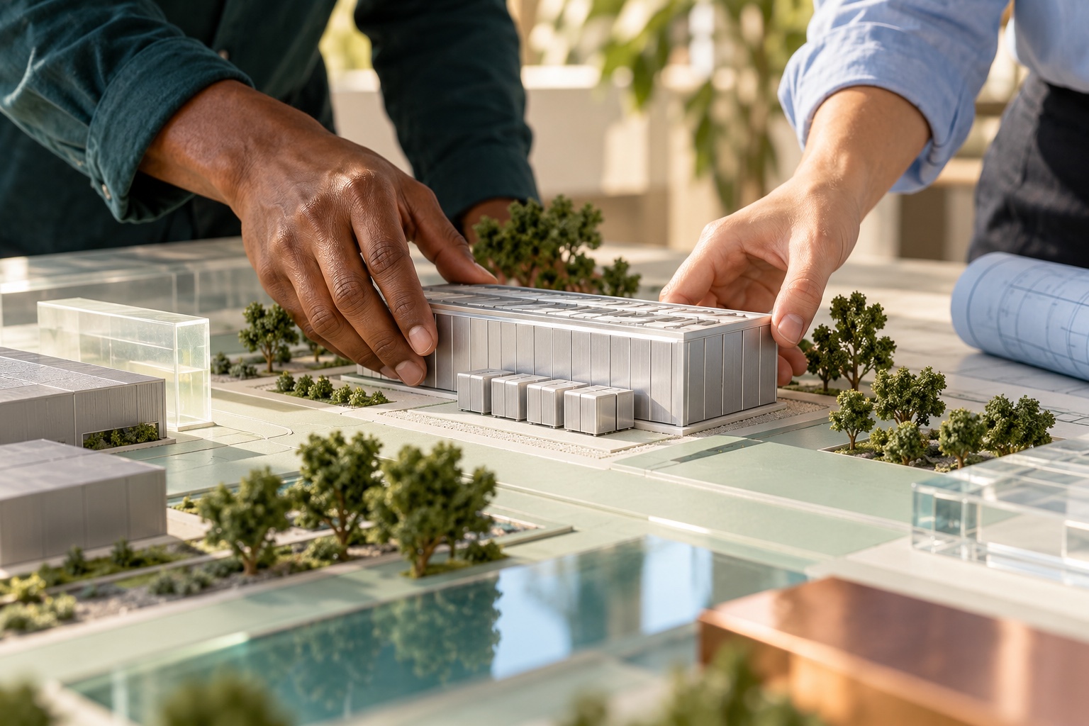
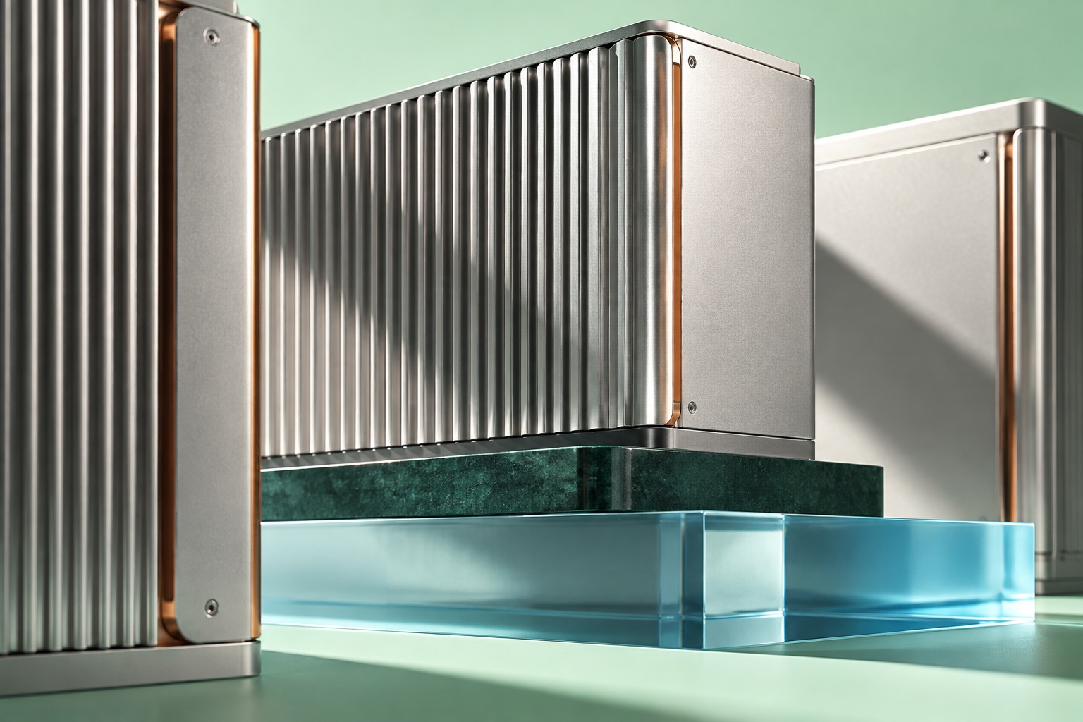
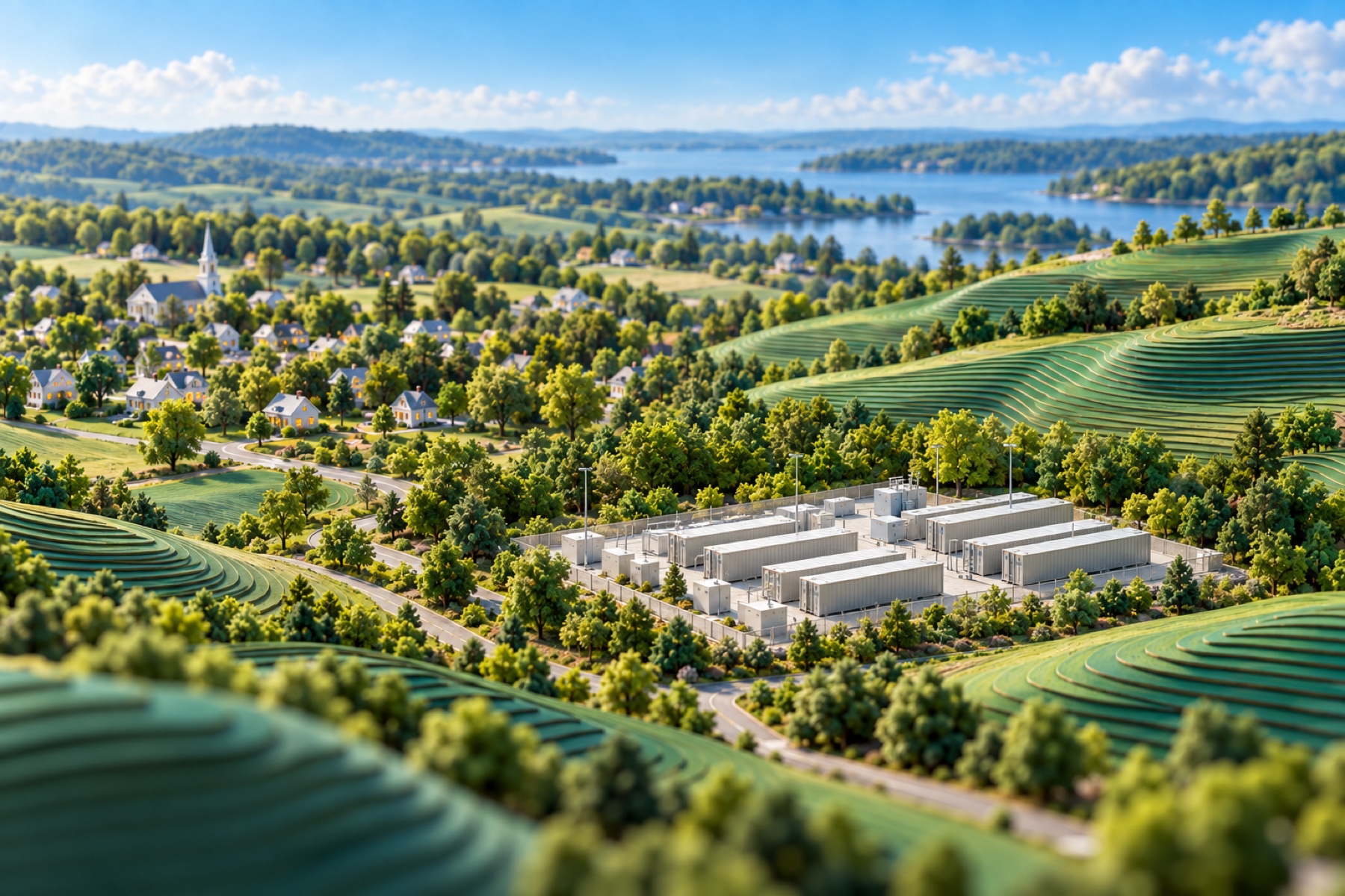
These are generated concept illustrations from the website artwork library, not photographs of owned sites or completed projects. Keep this provenance in asset records and use an explanatory caption where the context could mislead. Avoid generic solar panels, unrelated skylines, harsh HDR, mismatched photographic styles and repeated blog covers. Use one distinct image per editorial topic.
Motion should feel deliberate. Let compositions breathe and content arrive gently; keep the logo’s orientation stable and the reading experience calm.
Slow alternate drift, ±10 px. Supporting image scale: 1–1.05. No logo spin. Pause motion from the page header.
Opacity and 24 px upward arrival, once on entry. Ease: cubic-bezier(0.22, 1, 0.36, 1). Never hide essential content permanently.
Use a slight color change and 2 px lift for hover. Touch uses normal tap feedback; no hover-dependent information.
System reduced-motion disables animation and movement. Keep every specimen, navigation link and download available. No flashing, autoplay audio or scroll hijacking. The opening brand composition can be saved as a still PNG.
Download static posterUse a disciplined scale, simple controls and considered image crops. These application specimens show how the identity carries across formats.
48 px target height · 24 px horizontal padding · pill radius · weight 600. Keyboard focus uses a 3 px turquoise ring. Press removes the hover lift. Loading and disabled states prevent activation.
Enter a complete email address.
Component specimens only. No information is submitted.
Show the current milestone, relevant context and next decision. Use verified information in a live project card.
Label / Value / Source / Updated internally
Use the same hierarchy on dark surfaces. Bright brand color adds emphasis; it does not replace readable labels.
Mobile specimen
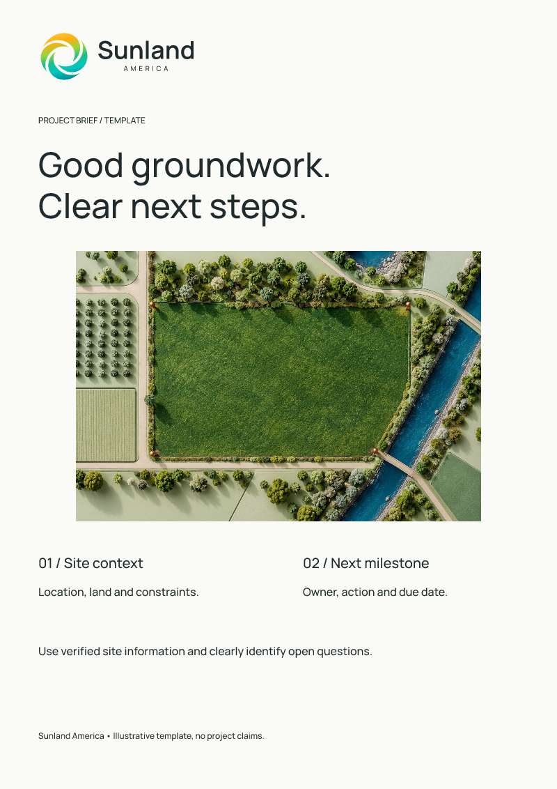
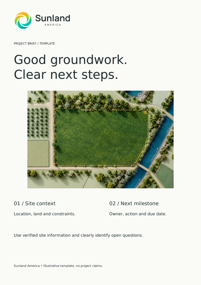
Project brief / A4 proportion · Editable SVG
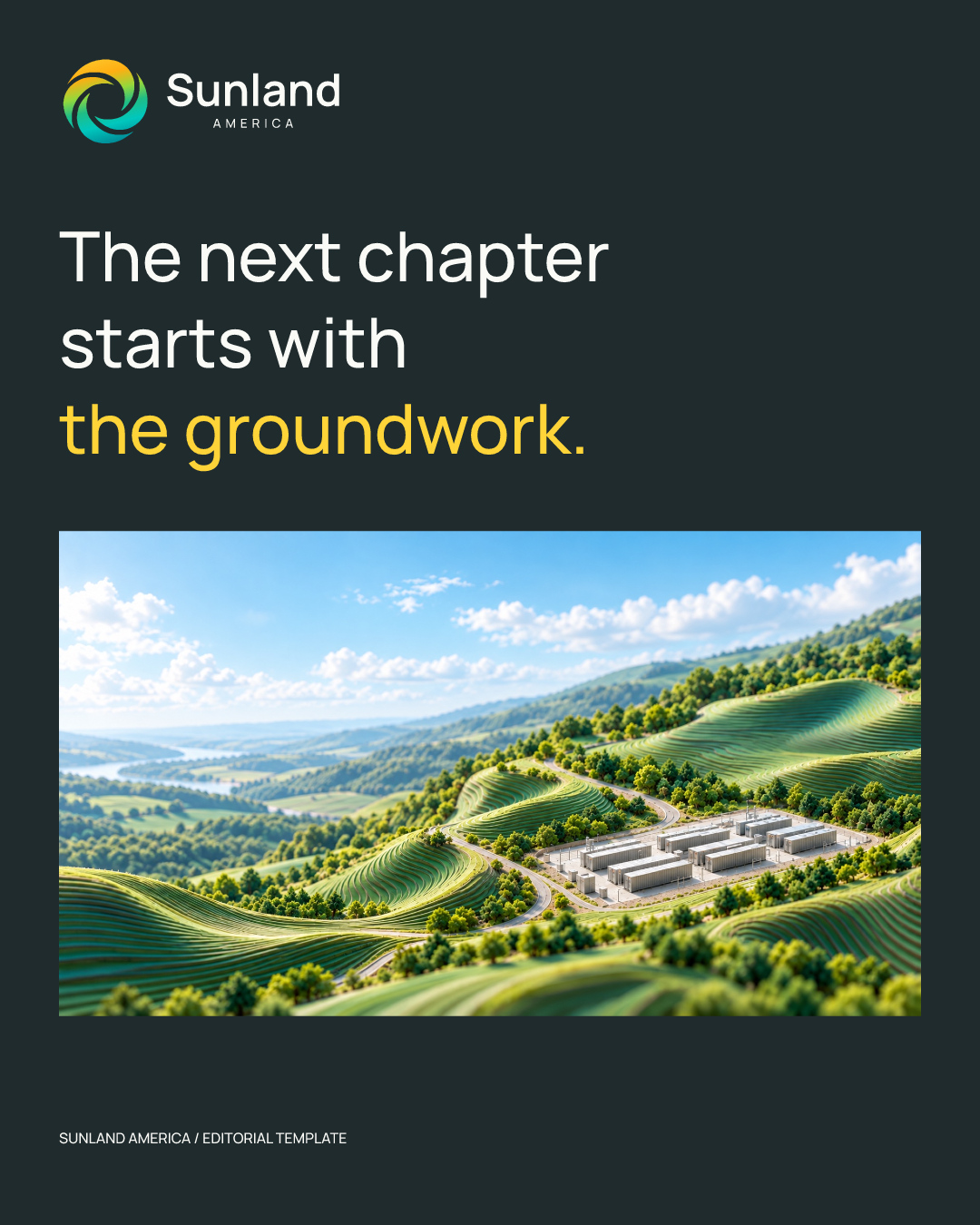
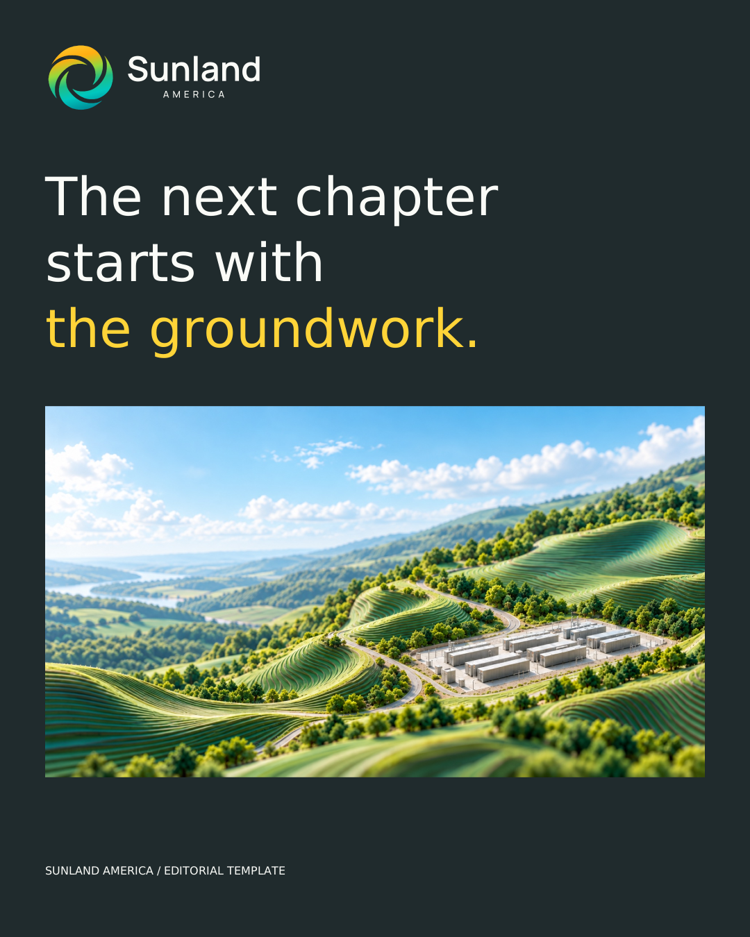
Editorial / 1080 × 1350 · Editable SVG
Use a 1,440 px content maximum; 20–64 px fluid gutters; a 4 px spacing base; 24–32 px card gaps; 12 px image corners and 16 px card corners. At 760 px, stack multi-column content. Keep logos on solid panels and body copy within 65 characters per line.
Supporting icons: simple 1.5–2 px strokes, rounded joins, consistent 24 px viewbox. Use familiar functional symbols; the brand mark is not a button icon.
Use the supplied files as the source of truth. The complete kit includes outlined and editable logos, fonts, icons, templates, tokens and this guide’s source.
{
  "semantic": {
    "text": "ink",
    "surface": "paper",
    "action": "ink",
    "actionText": "paper",
    "textSecondary": "muted",
    "surfaceAlt": "mist"
  },
  "font": {
    "family": "Manrope",
    "fallback": "Arial, sans-serif",
    "weights": [
      400,
      500,
      600,
      650,
      700
    ],
    "license": "SIL Open Font License 1.1; bundled with font files",
    "logo": "Sunland: weight 650; AMERICA: weight 500 with 0.37em tracking, centered beneath the visible Sunland lettering. Distributed logos use outlined lettering."
  },
  "motion": {
    "feedback": "180ms",
    "reveal": "700ms",
    "ambient": "18s",
    "ease": "cubic-bezier(0.22, 1, 0.36, 1)",
    "travel": "24px",
    "reduced": "Static; all content visible"
  },
  "layout": {
    "max": "1440px",
    "gutter": "clamp(20px, 4vw, 64px)",
    "mobile": "760px",
    "bodyMeasure": "65ch"
  }
}
Version 1.1 · October 2026 · Modern Classic selected by Pete; vector refinement and detailed usage rules prepared for review. Font licensing is included. Digital colors are sRGB; print requires proofing. Read the usage notes.